Islamic Art Exploration

My goal as an educator this year is to intentionally focus on the cultural side of mathematics through authentic applications.  During the geometry unit in pre-algebra, my students explore the intersection of geometry and Islamic art. After studying quadrilaterals, we started playing with 5 and 7 overlapping circles through activities outlined in the book Islamic art and Geometric Designs. Screen Shot 2018-02-01 at 6.37.56 PM.png The activities expose students to the regular shapes that can be made from circles. At first, we worked with compass and rulers, and I gave students the option to work on GeoGebra.

Two videos that explain the process and significance:

The students worked on their project over a week. We first looked at developing an appreciation of the creation process, then started analyzing photos. I used some designs from Eric Broug’s book to help students explore the patterns in the designs and deconstruct designs.

Here is a link to analyzing a pattern tile, Complex Islamic Geometry. Some imagines are taken from Eric Broug’s book and a Thinking Routine from Agency by Design (Parts Purposes, Complexities).

After going through examples and making connections between geometry properties and overlapping circles, we started on the project. Instructions for students Islamic Art Project.

Students used GeoGebra or compasses to create different pattern tiles. We used about 2-3 class periods for students to create a design then one lesson to work on the write-up. I did not assign homework through the process as I wanted to make sure to be available to answer their questions and provide technical help. Upon completion as hosted a Gallery walk to observe student work. I invited fellow teachers, administrators and Grade 2 students joined us since they were kicking off their Geometry unit. It was beautiful to see the students give the second graders a guided tour.IMG_3988.jpg

Overall the students improved describing their process, their use of mathematical vocabulary, comfort level with GeoGebra, and learned about some of the cultural significance of geometry to Islamic Cultures.


IMG_3967.jpg
Student work 2
IMG_3966.jpg
This student highlighted different parts of her design to explain her process


Resources from my “Math and Media” Newseum Presentation

Big thank you to the Newseum for the opportunity to present.

For those that were not able to attend the Teacher Open House at the Newseum here are the resources I highlighted in my session on “Math and Media.”

IMG_2115

The Newseum’s Website has the Today’s front pages available for download. You can search using the map, which is kinda cool.

Rather than printing out the front pages students can download the pdf and measure the proportions using GeoGebra.

Here is an example of an activity to do with students.

Guiding Question:

“What information does the Front Page tell us about the news that is important to that state/region?”

Act one: Measurements

Working in groups of 1-2 students will need access to a computer and the internet or multiple printed out front pages.

Student Instructions:

  • download the pdfs of front pages
  • save the front pages as jpegs.
  • Upload to Geogebra
  • Measure the line segments or make polygons over the areas and GeoGebra will find the area.

Students will input the data into a google form or a printed table to record the following information: (Example of FrontPage Proportion Data collection )

  • Date
  • State
  • Newspaper
  • Newspaper measurements
  • Article measurements of photos and text
    • length
    • width
    •  topic

Screen Shot 2017-10-08 at 11.16.19 AM

Act Two: Analysing results 

Students will use math to explore the following question.

“What information does the Front Page layout reveal about the news that is important to that region?”

Ask students to determine if they need more information about the state or other newspapers. How are they going to determine the value of a story? What will their measurable criteria be?

Act Three: Presenting and Comparing

Allow students time to compare their results with other groups.

  • What did they notice about other states?
  • For that day, were the same stories covered?
  • Who was represented in the paper? Were they shown in a positive or negative light?

Extension: 

Have students collect data over a 4 month period time for one particular newspaper to analyze broader trends in the Front Page layout and featured stories.

I am going to do this activity as a slow data collection project with my grade 7 students. I will share the forms and reflections along the way. Please let me know if you try this activity and share your feedback.

Keeping Ageing Technology Alive- Smithsonian Learning Lab Activity

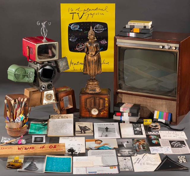
In July, I visited the Scottsdale Museum of Contemporary Art (SMoCA) in Arizona. I had the privilege of Laura Spalding-Best, the Exhibition Manager, giving me a tour of the artworks on display. While showing me Nam June Paik’s “Electro-Symbio Phonics,” Best made a comment that peaked my interest in the problem-solving curators and art handlers face to show his work. Best mentioned that when SMoCA received the artwork, it came with 20-30 spare Cathode Ray Tube (CRT) TVs for when TV monitors malfunction. I had never considered the complications that can arise in presenting and maintaining his work, as well as, other media art.

Through the Smithsonian the Learning Lab, I researched the lengths curators, and art conservationists go to, to keep ageing technology alive. It is absolutely fascinating the problem-solving, creativity, and innovations involved to display the artwork of Nam June Paik, the father of media art. I created a collection on the Learning Lab that allows students to make predictions on how many TVs are needed for Paik’s artwork, to learn about the properties of CRT-TVs, and to plan a media art piece that can adapt to new technology.

Please email me or comment if you have feedback on my collection, “Keeping Ageing Technology Alive.”

PAIK_ 019
Paik, Nam June. Nam June Paik Archive. Smithsonian American Art Museum, Washington, D.C., americanart.si.edu/collections/search/artwork/?id=77502.

Learning Lab Activity

This week I started playing around with the Learning Lab, the Smithsonian online platform that allows you to build collections to use with your students.

Check out the activity I made using the Learning Lab platform called Unpacking Sol LeWitt’s open cubes.  The activity allows students to apply what they have learned about drawing 3D shapes and nets. Since making the activity, I have not looked at isometric paper the same. Looking through his variations of open cubes exercised my visualization skills of 3D objects. Noticing which lines were gave the shape more a of 2D feel or 3D feel.

This activity has students make connections between the planning phases, chair design then links to the optical illusions that OK GO! (Smithsonian Ingenuity Award winners) uses in their music video “The Writing’s on the Wall” 

Enjoy, and please send your feedback.

CHSDM-642035130D7E2-000001
Photo from Smithsonian, Learning Lab

Continue reading “Learning Lab Activity”

Conditional Probability

Today in class I introduced conditional probability to a class of grade 11 students. We started by looking NCTM’s conditional-probability-comic activity that uses USA census data on inmates on death row. After introducing the idea of conditional probability, the students completed the table about the marital status of inmates on death row. We discussed sample sizes, and the danger is making a generalization about a group. Cathy O’Neil write more about the risks of using statistics out of context or a manipulated context, in her book Weapons of Math Destruction.

Next, we did the Thinking Routine I see…I think… I wonder… while looking through data daily_arrival_greece from the UNCHR. I asked the students just to notice the data, the graphs, and that would lead us in what conditional probability we would find.

The students asked about: gender, unaccompanied minors, why the children in the pie chart did not have a gender breakdown, what is the age range of a child, how many of the men were married, left behind families, the professions, etc. It led to interesting questions about documented, undocumented refugees, the differences between asylum seekers, transportation, the length of stay in refugee camps for the people, etc. The discussion was rich, and even though we were looking at the numbers, the numbers were much more in-depth since we knew that the values represented people with families and lives.

Then in groups, we worked on finding conditional probability of refugees by origin and the changes in November and December of 2016. We discussed who this information would be relevant to, and areas for further research.

To the math teachers out there, please feel free to use the ideas and comment if you have suggestions. I am planning on looking more at organizations in Greece that are offering help to refugees, specifically children.

Zoom In on Graphs

It has been a while since I posted about math, travels, or lesson ideas. My New Years intention is to post more frequently about my travels as well as ideas on lessons.

This is a lesson starter to slowly look at the components of a bar graph. You can stop after the bar graph or choose to explore ratios and how those change over time. In the context of the Women’s March on Washington, the graphs and data will be about the demonstration and female representation in the USA in government.

Zoom In is a Project Zero Thinking routine. I have adapted it to look at graphs rather than at a work of art.

Zoom In works well if you give students time to silently think then share as a class or with a partner. Don’t rush through the slides. Have the students make predictions, discuss aspects of the chart, determine the scale, identify if it is a histogram or bar chart, how can they tell, or what information do they need to make a better guess at what the chart shows.

I hope this helps you bring more of the news and current events into the classroom and help our students become numerate while reading the news. I like to use The Economist for gathering graphs, the ones used are from Time and are in the notes.

Zoom In: January 2017 Lesson starter

Miami Art

We spent 10 days in Miami preparing for our first semester of travel. Between getting the documents ready and brainstorming, I saw the Basquiat exhibit at the Perez Art Museum of Miami and meandered through Wynwood Walls.

The Perez featured Basquiat’s notebooks and a few of his collaborative works with Andy Warhol. I watched the showing of film Basquiat afterward. Jeffery Wright’s performance as Basquiat was very moving, highlighting Basquiat’s artistic expression, struggles, and highlights exploitation in art. David Bowie performed an excellent rendition of Andy Warhol and his voice was stuck in my head for a couple of days.

Until I walked through Wynwood, I did not realize that Miami was a hub for curated graffiti. Here are a few of my favorites pieces from my walk.


On another note, for an educational module, we are thinking of doing public art with students that are legal and does not leave a mark or something to clean up any suggestions?

Introduction to Statistics and IB math exploration

I have not posted for a while but interesting math still has been adding up.

I posted previously about iTunes and statistics. I recently revised the activity to compare more countries and introduce statistics. The students were give data from USA, Australia, Nigeria, India, and Germany and put in groups to look through the top 20 sales in iTunes.

While the students sorted the data they listened to the songs, discovered Bollywood, Highlife from Nigeria and realized the Justin Bieber was a hit across the board. Here is the student handout. I distributed using google docs so the students could edit the document together and have it as a record.

Lesson1studenthandoutiTunes

The second activity investigated how statistics can be used to change policy. The students first watched The Story of the Plastic Water bottle to understand . And then were given data from Rock Creek Conservancy  on trash pick ups from the last years. Students were given an introduction on excel formulas, how to sort data and needed to use statistical measures to investigate trends. The goal was to look at the local level, national and global, as well as exposed the students to the amount of plastic in our water ways.

More to come…


Refugee data

At an assembly in the fall at Washington International School had a guest speaker from the organization Free Syria speak to our students about the current crisis. She gave the students more of a background the crisis and referenced data on the amount of refugees. This inspired me to do some research and to encourage a student to do a mathematical paper on the topic.

I looked for the data on the amount of Syrian refugees leaving as well as the amount of refugees that other countries have historically accepted and registered. I found raw data from the World Bank on countries from 1990 to 2014. (If you have not looked at the World Bank’s data, I highly recommend seeing what they have based on topics). In my spare time, I have been sorting the data and looking for trends, as any math teacher would do. Recently I sorted the countries by income level based on the World Bank’s definition and already stated in the data sheet. The graphs of the totals since 1990 of the countries based on income is displayed in the following graph using Excel. Screenshot 2015-11-29 11.35.33

I find it rather surprising that the High Income countries admit fewer refugees than most other countries. When looking at the data of the High Income countries closer, Quartile 1 and median are relatively close.

Screenshot 2015-11-29 11.57.48.png

I made another graph of individual High Income countries: USA, France, Germany, Canada, Sweden, and UK. Screenshot 2015-11-29 11.51.29

With the exception of Germany, most of the graphs gradually increase or decrease. When looking at the graphs of the 5 statistical measures, we can see that Germany’s data influences the standard deviation. For the graph of the USA there is an interesting spike in 2006. What explains that spike in USA’s policy?

I am going to continue to run different statistics in preparation for my grade 9 statistics unit. I am curious what is happening with the Low & Middle Income countries that allows them to admit more refugees.